

COLOUR TRENDS 2015/2016 TAKE YOU HIGHER UP!
The Color trends study from Antron® carpet fibre reveals new influences with the 2015/2016 forecast.
As from the last few years, INVISTA’s Antron® carpet fibre has released the latest edition of its Global Trend Forecast, an insightful look into the global influences on colours within commercial interiors.
Developed in association with Global Color Research,in London, Global Trend Forecast 2015/16 once again identifies four key themes that are shaping our relationship with colour.
Identifying increasing sensorial and immersive engagement with products, Global Trend Forecast 2015/16 continues the research of Antron® carpet fibre into colour, its influences and the impact it has on our working spaces.
The four themes of:
Elemental Order
Optic Balance
Make Shift
Immersive Tactility
are identified as key drivers shaping colour through the next two years. Each deals with a unique set of influences from across the globe, highlighting the merging cultural boundaries afforded by our relationship with technology and products, that means boundaries are increasingly more transcendent than defined:
“The Global Trend Forecast reveals that as we connect with the world around us and try to make sense of rapidly developing product and technological landscape, we look to colour to help us understand, provide clarity and reassure us,” explains the marketing communications manager.
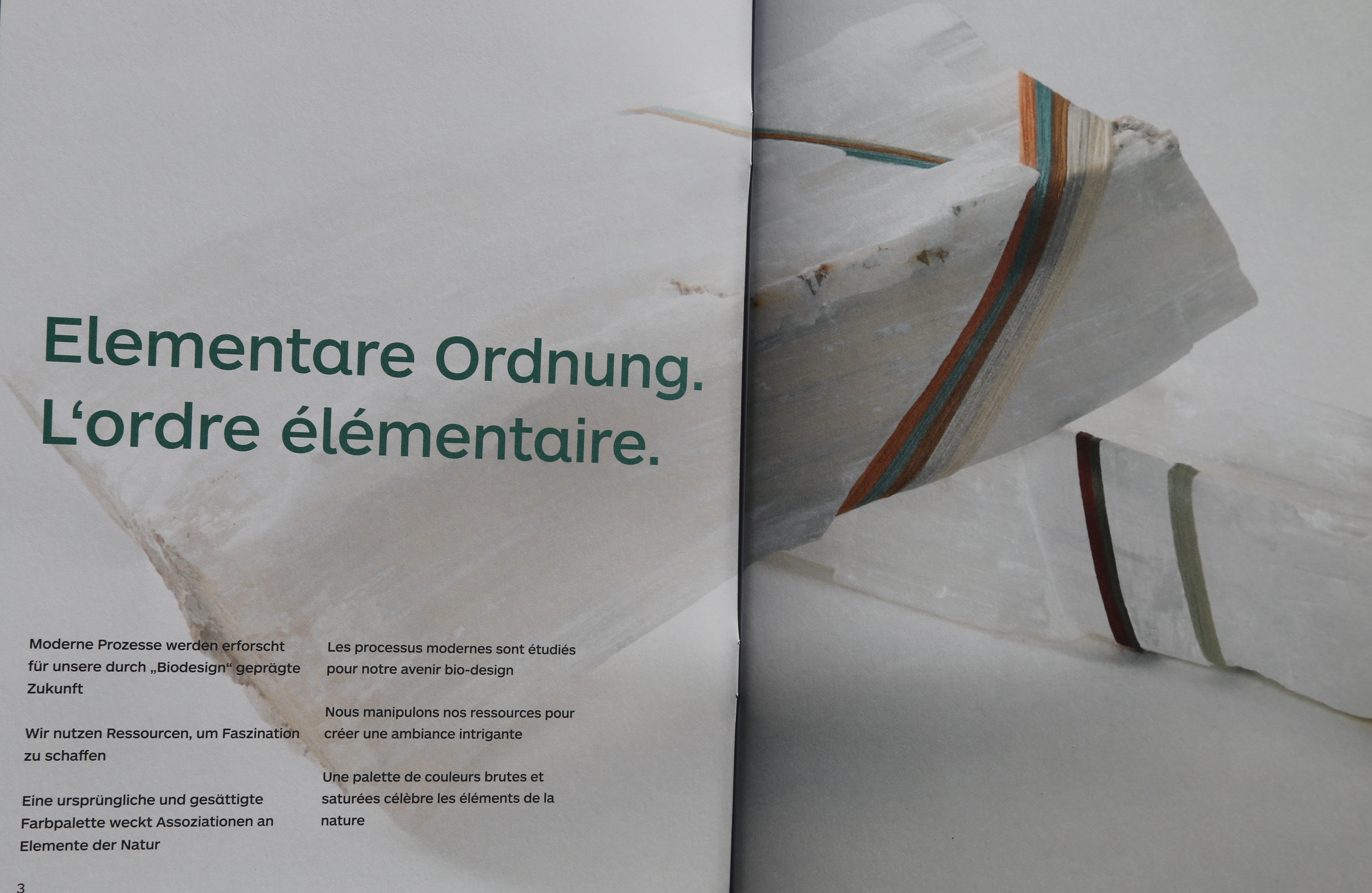
Elemental Order:
 This theme discovers modern processes explored for our bio-designed future to reveal a raw and saturated colour palette celebrating nature’s elements.
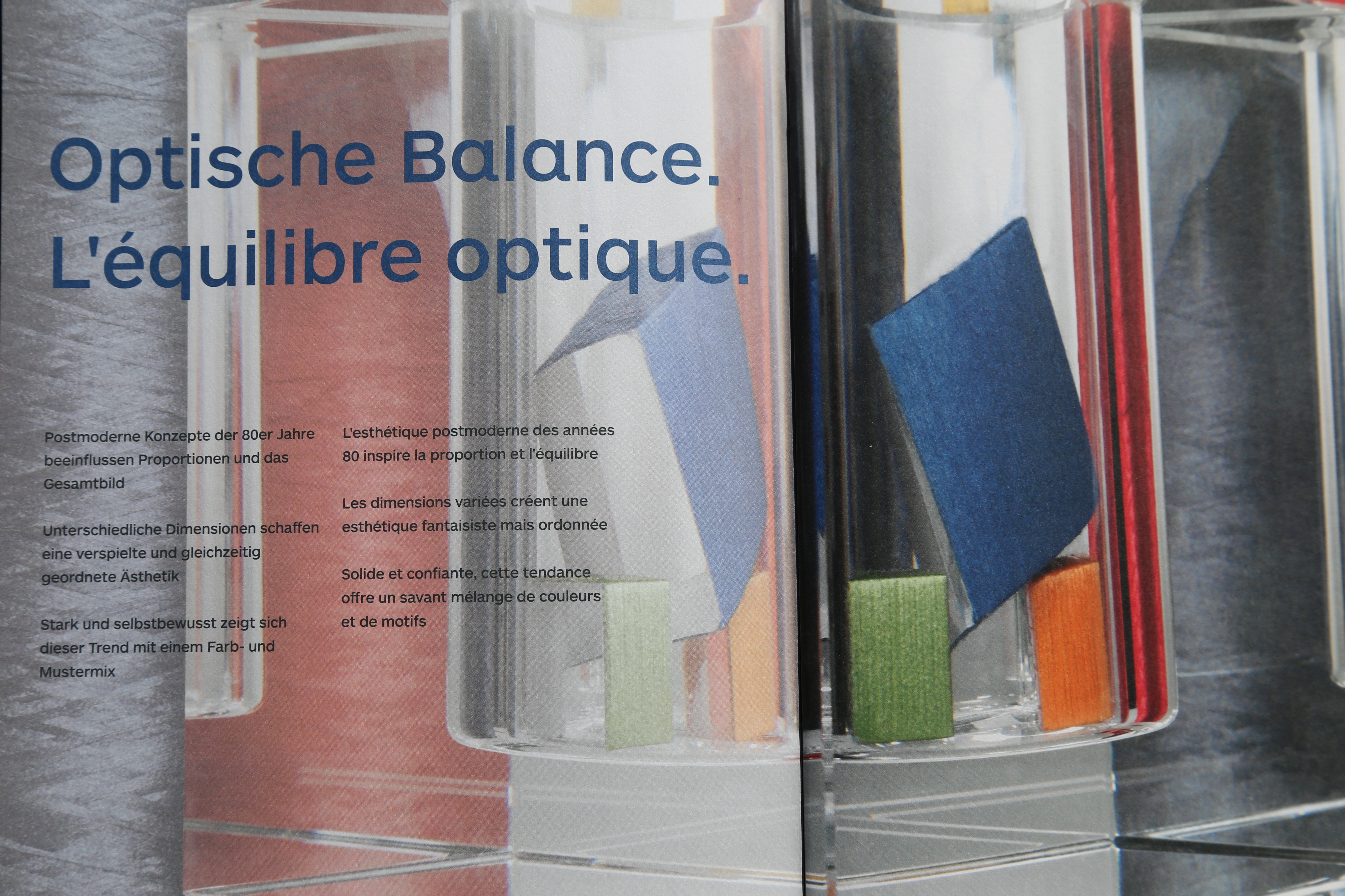
Optic Balance:
 Post-modern aesthetics of the 80s create a playful yet ordered aesthetic in a strong and confident palette of colours.
Make Shift:
 Hybrid design that mix and matches materials creates a new aesthetic to reveal a colour palette with a positive take on the industrial theme.
Immersive Tactility:
 This theme looks at how user experience puts the focus on both physical and visual texture creating a palette of saturated colours and greyed off pastels.

The themes each reveal a palette of colours demonstrating a flux from 2014/15 research to an increasing variety of yellows, the growing presence of more welcoming and warming reds, a refinement of pinks-purples as well as blues, and the appearance of more sultry hues of green. Cool neutrals are becoming purer and more sophisticated, while warm neutrals are given more presence with milky tones giving a more organic look.
We will present and develop each theme separately in the next four month, in the meantime, you can ask for your free brochure, at contact@13atmosphere.com.
Please be back on the 13Th June for the first theme: Elemental Order
THM & 
L'EXPO A NE PAS MANQUER A PARIS

ET CELLE CI AUSSI

Archives
-
▶ 2025
-
▶ 2024
-
Nov 2024
-
Sep 2024
-
May 2024
-
Feb 2024
-
Jan 2024
-
-
▶ 2023
-
Nov 2023
-
Sep 2023
-
Jul 2023
-
May 2023
-
Mar 2023
-
Jan 2023
-
-
▶ 2022
-
Sep 2022
-
Jun 2022
-
Mar 2022
-
Jan 2022
-
-
▶ 2021
-
Nov 2021
-
Sep 2021
-
Jul 2021
-
Mar 2021
-
Jan 2021
-
-
▶ 2020
-
Nov 2020
-
Sep 2020
-
Jul 2020
-
May 2020
-
Mar 2020
-
Jan 2020
-
-
▶ 2019
-
Nov 2019
-
Sep 2019
-
Jul 2019
-
May 2019
-
Mar 2019
-
Jan 2019
-
-
▶ 2018
-
Dec 2018
-
Sep 2018
-
Jun 2018
-
Apr 2018
-
Jan 2018
-
-
▶ 2017
-
Nov 2017
-
Sep 2017
-
May 2017
-
Mar 2017
-
Jan 2017
-
-
▶ 2016
-
Dec 2016
-
Nov 2016
-
Oct 2016
-
Sep 2016
-
Aug 2016
-
Jul 2016
-
Jun 2016
-
May 2016
-
Apr 2016
-
Mar 2016
-
Feb 2016
-
Jan 2016
-
-
▶ 2015
-
Dec 2015
-
Nov 2015
-
Oct 2015
-
Sep 2015
-
Jul 2015
-
Jun 2015
-
May 2015
-
Mar 2015
-
Feb 2015
-
Jan 2015
-
-
▶ 2014
-
Dec 2014
-
Nov 2014
-
Oct 2014
-
Sep 2014
-
Jul 2014
-
Jun 2014
-
May 2014
-
Apr 2014
-
Mar 2014
-
Feb 2014
-
Jan 2014
-
-
▶ 2013
-
Dec 2013
-
Nov 2013
-
Oct 2013
-
Sep 2013
-